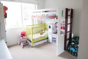
Love vibrant colours, but afraid to decorate with them? Fortunately, we’ve got the colour code. Follow these six very simple rules and you’ll be colour coordinated!
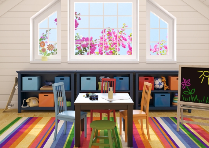
Guideline 1: Law of Percentages
Don’t worry—there’s very little math involved. Colours featured throughout a room should be divided into percentages: 60%, 30%, and 10%. The most prevalent colour should be featured throughout about 60% of the room; the ancillary colour should be featured throughout 30%; and an accent colour provides a pop throughout 10% of the room. In easer terms: the wall colours may boast the prevalent colour (60%), the couch, upholstery, and trim may feature the ancillary colour (30%), and decorative pieces may depict an accent colour (10%).
Guideline 2: Go Big in Small Spaces
Use really bold, vibrant colours in small rooms like the bathroom and closets. Going strong in small spaces makes a statement and adds life to your home without being overwhelming. This is also a great way to get you more comfortable with using colour if you’re feeling gun shy.
Guideline 3: Paint it Black
This is an interior designer’s secret—and we’re ready to share: in colourful room, always display one small decorative item that’s black. This provides a cool contrast in your rainbow room and makes the colours really pop.
Guideline 4: Have a Light Bulb Moment
Consider the lighting in a room before deciding on a colour scheme. Rooms that get plenty of natural light or have an excellent and very bright artificial lighting system are perfect for vibrant, deep, and dramatic colours. Dark rooms are better suited in cooler tones like pastels or pale hues.
Guideline 5: In Your Wheelhouse
 When conceiving of the colour scheme, keep the colour wheel in mind. Your room should have a complementary colour scheme or an analogous colour scheme. Complementary colours sit across from one another on the colour wheel, use those to create a harmonious contrast throughout a room. Analogous colours sit next to one another on the colour wheel, choose this scheme for a more serene style.
Guideline 6: From the Light into the Dark
Always plan your colour scheme so that the darker colours are featured in the lower elements of the room and lighter colours in the higher elements. This is pleasing to the eye and lends a certain tranquility to your style. The darkest part of your room should be the floor, while the lightest part should be the ceiling. Consider painting the ceiling a different colour or use a light trim where the walls and ceiling meet.